My favorite sans-serifs and where I use them
I’m not a designer. I don’t know much about x-heights or kerning pairs.
But I stare at a screen for a living. When you spend that much time looking at websites and ui interfaces, you start to develop favorites.
Here are six sans-serif fonts I keep coming back to.
#Inter
Available on: Google Fonts →
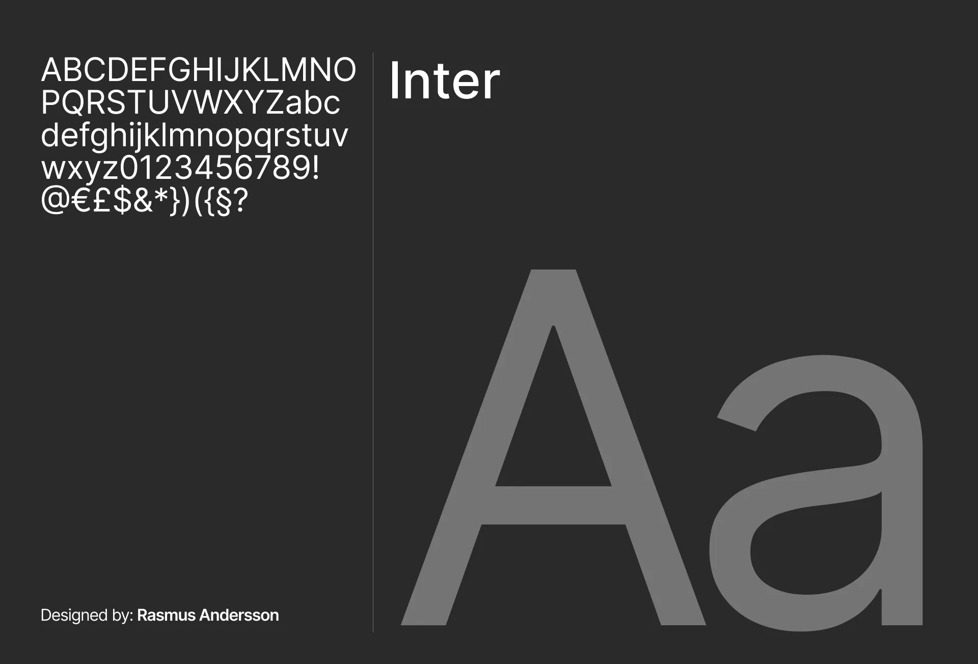
The default. The workhorse. The one everyone uses for a reason.
It’s not exciting, but it’s never wrong. Whether it’s body text, complex UI, or a quick mockup, Inter just works. It’s highly legible even at tiny sizes.
Pro tip: Use font-feature-settings: "cv11" to get a single-storey ‘a’. It instantly makes the font feel less generic and more modern.
Where I use it: Dashboard UIs, SaaS products, and any project where I want the design to get out of the way.
#General Sans
Available on: Fontshare →
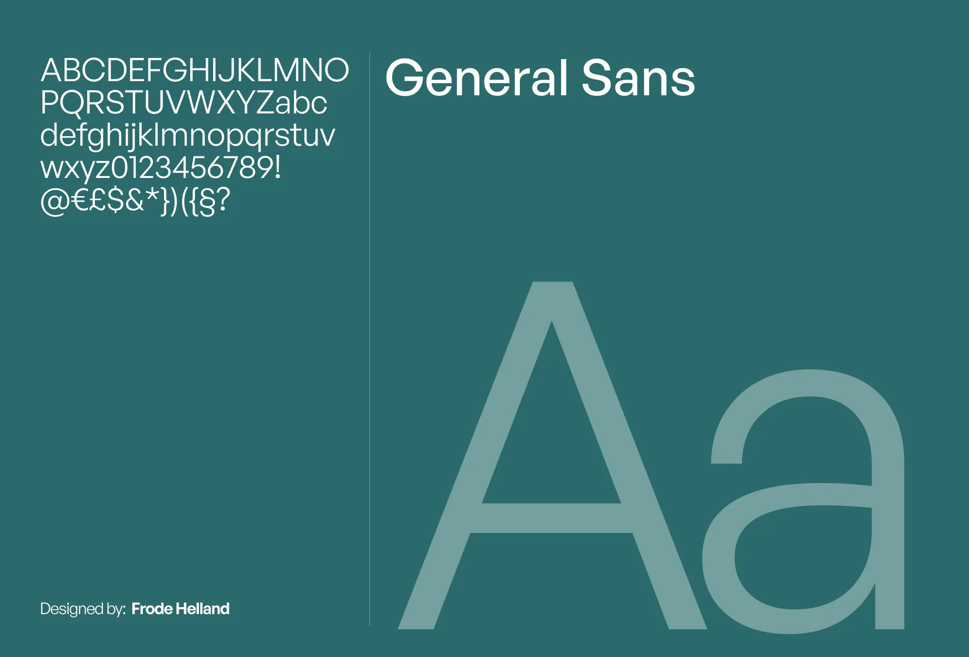
Professional. Sharp. Quietly confident.
General Sans is Inter’s sharper sibling. It has the same modern bones but with more precision—crisp edges and clean curves. It means business without feeling cold or corporate.
I use it when I want things to feel professional but not corporate.
Where I use it: Technical writing, and “clean” minimalist layouts.
#Hanken Grotesk
Available on: Google Fonts →
Think of this as Inter’s cooler, friendlier cousin.
It keeps those reliable geometric bones but adds a bit more roundness. It’s approachable and less “system-like” than a standard neo-grotesque.
Where I use it: Blog post headings, subheadings, and landing pages that need a touch of warmth.
#Bricolage Grotesque
Available on: Google Fonts →
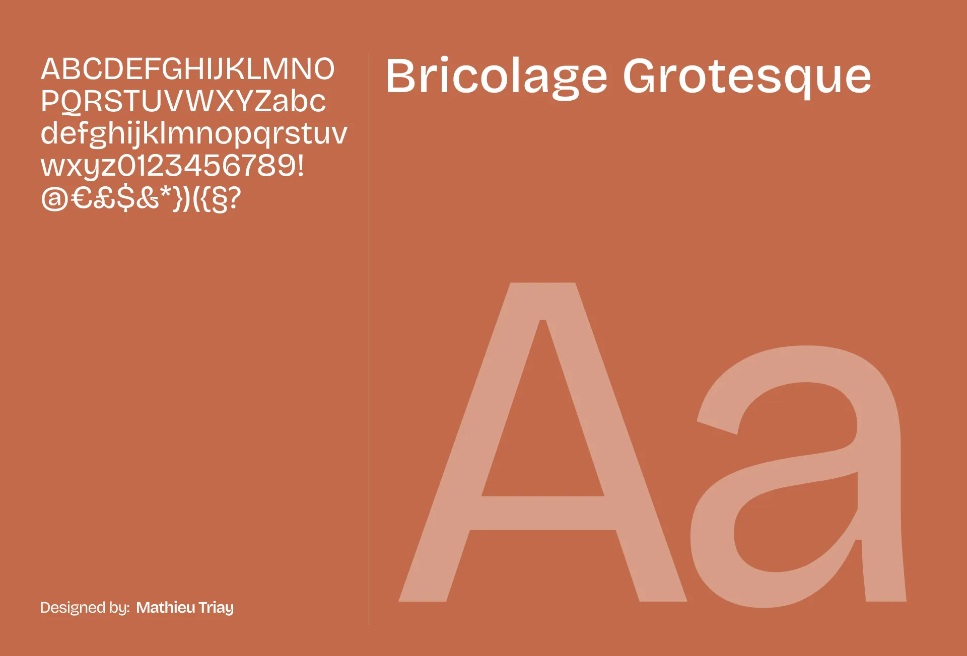
The strange one.
It’s a “grotesque” (old-school sans) but with a beautiful, wobbly personality. The letters aren’t perfectly uniform, giving it a handmade, expressive feel that’s rare in digital fonts.
Where I use it: Creative experiments, personal projects, or when I want a site to feel “indie.”
#Syne
Available on: Google Fonts →
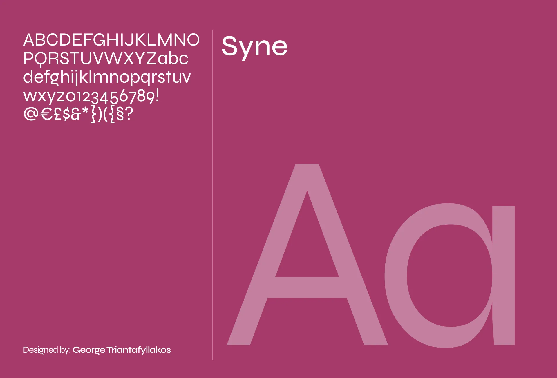
Loud. Confident. Chunky.
Syne isn’t subtle. The letters are wide. The curves are dramatic. It’s not a body text font. it’s a statement font.
Where I use it: Hero section headings and big, bold titles that need to command attention.
#Inclusive Sans
Available on: Google Fonts →
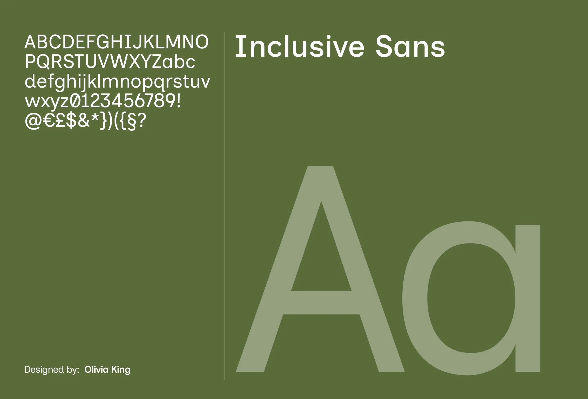
This one is special.
It was designed specifically for readability, helping people with dyslexia distinguish between similar letterforms (like ‘I’, ‘l’, and ‘1’).
But even without that context, it’s just a really nice font. Friendly. Warm. Modern without trying.
Where I use it: When I want people to feel welcome
#Quick Comparison
| Font | Vibe | Best For |
|---|---|---|
| Inter | Reliable | Everything default |
| General Sans | Professional | Technical writing, sharp designs |
| Hanken Grotesk | Friendly | Headings, warmth |
| Bricolage Grotesque | Weird | Creative projects |
| Syne | Loud | Hero Sections |
| Inclusive Sans | Welcoming | Accessible Content & Docs |
#I gotta admit
I don’t know the right terminology for half of what I just wrote.
I just know what I like looking at.
Maybe one of these will be your next favorite too.
Peace ✌️.